Overview
How to create a RowText-Image?
How to create a WordCloud-Image?
Generally
Choose a photo that has good quality, a simple background, strong contrasts and a resolution of at least 1 megapixel (1 MP) – 1,5 megapixel (1,5 MP). The higher the resolution the better will be the results – especially if you like to have a nice representation of the details of an image (e.g. eyes). Don’t expect any good result if you come up with a picture of 640×480 pixel ![]() . The photo shouldn’t be noisy. You may do some preparations with an image processing software?! Furthermore, you can load images with a transparency background (e.g. png files). The generator ignores transparency parts while creating the Text-Image. By using an image processing software you can create Text-Images where some parts of the image is covered with text while other parts keep the its original content:
. The photo shouldn’t be noisy. You may do some preparations with an image processing software?! Furthermore, you can load images with a transparency background (e.g. png files). The generator ignores transparency parts while creating the Text-Image. By using an image processing software you can create Text-Images where some parts of the image is covered with text while other parts keep the its original content:
After the image conversion you can save the Text-Image in JPEG format, as PNG or as SVG file. Important, saving to a SVG file is not available to images that have been created with the WordCloud generator and when the option Plain-colored words is enabled. Please also keep in mind that the SVG file can increase to multiple megabytes, you should use only special characters supported by your chosen font(s) and that a saved SVG file may looks different on different browsers and viewers!
? … You can find more information in the tooltip output or information is linked with ?.
! … Caution, be prepared for longer processing time. You may find more information in the tooltip output.
How to create a RowText-Image?
You can use short or large paragraphs of text (e.g. poem). Than the text generator will place this text to generate your Text-Image. If you use special characters e.g. “♫ ♪ ♩” please note that your chosen font type may doesn’t support these characters (especially if you like to make a SVG output)!
After loading a photo the generator calculates a recommended text size which depends on the size of the photo and on the specified Paper size. The reasons behind this is that we want to ensure that the text is still readable after the Text-Image is printed. It means the text size will also be updated when you change the Paper size. Of course, it is always possible to set a customized text size.
1.) Converted images may look better when you increase the contrast of the original photo:
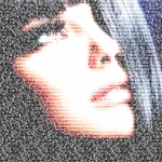 Strong contrast of the original photo. Strong contrast of the original photo. |
2.) You may would like to have one text size for the whole converted image. In this case set the same value to the Size and Minimum slider:
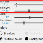 Setting the same or different values for Start size and/or Minimum results in … Setting the same or different values for Start size and/or Minimum results in … |
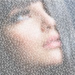 … an image with 1 text size or … … an image with 1 text size or … |
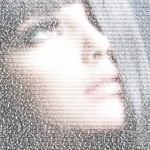 … an image with different text sizes. … an image with different text sizes. |
3.) You can also change the look of an image by setting different Line spaces:
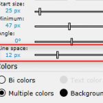 Setting custom values for Line space results in an image … Setting custom values for Line space results in an image … |
 … with 6 px line space or … … with 6 px line space or … |
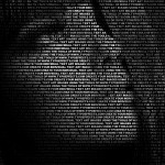 … an image with 12 px line space. … an image with 12 px line space. |
How to create a WordCloud-Image?
1.) You can use as many words as you like. To have an acceptable processing time we recommend to use less than 10 words. Typing space or enter will start a new word. Please keep in mind that the processing time will increase with every new word. If you use special characters e.g. “♫ ♪ ♩” please note that your chosen font type may doesn’t support these characters (especially if you like to make a SVG output)! Furthermore, you can use quotation marks in order to insert word groups:
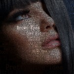 e.g. “Brown Eyes” “Girls Face” “Cool Pic” “Pretty Nice Idea” “It is amazing” e.g. “Brown Eyes” “Girls Face” “Cool Pic” “Pretty Nice Idea” “It is amazing” |
2.) We recommend to use short words. Too long words often don’t result in a good looking image (it depends on the original photo) because they are not fit without getting very small or increasing the variance (see later in this page).
 Short words often look better … Short words often look better … |
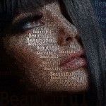 … than long words. … than long words. |
3.) You can also choose if you would like to have the word full-colored or each letter colored separately. Therefore, check or uncheck Plain-colored words:
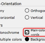 Check or uncheck Plain-colored words results in … Check or uncheck Plain-colored words results in … |
 … plain-colored words or … … plain-colored words or … |
 … each letter colored separately. … each letter colored separately. |
4.) Another possibility to change the look of an image is to use different word spaces:
 Using the Word Spcae slider results in … Using the Word Spcae slider results in … |
 … with 3 px space or … … with 3 px space or … |
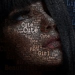 … with 6 px space. … with 6 px space. |
What is Variance: A Variance threshold value defines when a word fits inside a (homogeneous) region of the original photo. The lower the threshold value the better has a word to fit inside a region. An optimal value is different for each image, it depends on the contrast and on what you like to highlight in your picture. If you would like to capture the details of an image, e.g. eyes of a face, you should use a lower value. In case you like to point out some large headwords you better use a higher value.
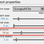 Using the Variance slider results in … Using the Variance slider results in … |
 … with 7 px variance or … … with 7 px variance or … |
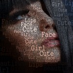 … with 18 px variance. … with 18 px variance. |
1.) By using the Text-Orientation Any be prepared for longer processing time (especially in combination with Processing Quality). You may get better results if you decrease the Start size and increase the Final size of the headwords (e.g. Start size with 44 px and Final size with 20 px). Below you can see two examples:
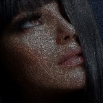 Small sizes often look better … Small sizes often look better … |
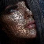 … than big, different font sizes. … than big, different font sizes. |
2.) Furthermore, may use another font type to increase the quality of an image conversion:
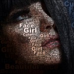 Conversion with Arial Black … Conversion with Arial Black … |
 … and Impact as font type. … and Impact as font type. |
